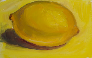
I wanted to practice painting lemons with different colored backgrounds to see how that affected the colors in the lemon.
These are 6" X 6", which I find difficult to paint on. I have large handwriting, and I feel comfortable painting on larger canvases. I think those two things are related.
When I was a little girl, my grandfather told me he liked getting letters from me (revealing my age...we used to write actual letters) because my handwriting was large and he could read it. I used to like getting assignments where the teacher said to write a page on a subject. Didn't take me all that many words to fill up a page. I felt sorry for those girls who wrote with little bitty handwriting. They may be the same girls who can paint little bitty paintings. Not that there's anything wrong with that! It's just hard for me.
6" X 6" oil on paper


What conclusions did you come to, might I ask?
ReplyDeleteI think I realized that the complimentary color of purple made the different shades of color in the the yellows look more alive. Probably everyone but me already knew that!
ReplyDeleteI found 6X6 inch paintings very difficult in the beginning...I like big canvases also. Love them all...the lemon and red background really pops! Nice job!
ReplyDeleteThank you, Linda. I think I need to learn to tone down my colors a little. I was looking at Carol Marine's painting and realized that so much of her painting is done with neutral or grayed-down tones. I want to try to practice that. However, I do love bright colors.
ReplyDeleteI love your lemon studies.
ReplyDeleteThank you, Angela. And thanks for visiting!
ReplyDelete