Tuesday, June 4, 2013

October on the Guadalupe River


12 X 16 Oil on canvas 
(Click on painting to view larger) 

Last October my daughter and I painted at a festival at a winery in Comfort Texas.  We drove on narrow country roads up and down hills through the countryside.  We crossed a small bridge over the Guadalupe River, and I asked my husband to stop so I could take some pictures of the river from the bridge.  This is painted using one of those photos as a reference.  

October in Central Texas doesn't have the spectacular colors of fall.  The live oaks, which are one of the primary trees in this area, don't lose their leaves until the spring.  They stay green all winter.  We have do have some subtle color changes, with an occasional tree or shrub glowing with bright colors.  

Thanks for stopping by.  

Saturday, March 16, 2013

Taos Snow Scene


This scene was painted from a photo I took in Taos at Christmas.  We rented a house out of town with our extended family.  Several mornings we went for a walk along the gravel road, trouping along with a couple of dogs.

The dogs were so funny running out into the trees and then back to their humans to touch base, then running out again.  They covered twice as much ground as we did, and I think they probably enjoyed it twice as much.  So many exciting smells!

This scene was on a cloudy day, and the light was very flat.   I loved the mistiness over the mountains.  And again I was amazed at how much color there was in the winter grasses and shrubbery.

Thanks for stopping by!


Wednesday, March 6, 2013

Snow scene in Taos


11 X 14 Oil on stretched canvas

I painted this from a photo I took on our trip to Taos at Christmas.  There was still snow on the ground under trees and shrubs.  I kept taking pictures and exclaiming, "look at all the colors!"

I was pretty happy with how this turned out.  It's my first attempt at using my own photos, rather than copying a painting.  I have another one that I'm working on.  I took lots of pictures, so I'll probably have a few more of basically this same color palette.

Thanks for stopping by!


Saturday, February 23, 2013

Peaceful Meadow Landscape # 14 after Kevin MacPherson


12 X 16 inch oil on stretched canvas.

This is the last painting in my series of painting from Kevin MacPherson's books.  I like it the best of all that I have done.  I really feel like I have learned a lot by this project.  My paintings don't look like his, but  using his paintings as a reference has helped me to paint in a much looser style than when I first started.  I was attempting to paint too much detail.  (Like every leaf!)

Below is a picture of his painting from his book.  You can see that mine varies a lot from his.  I actually chose this painting because of his lavender sky.   It looks beautiful in his painting, but mine just looked muddy and made my painting too dark.    So I changed the sky to a bright sunny day.


Thanks for stopping by and visiting!


Tuesday, February 19, 2013

Sunny Hillside...Painting # 13 after Kevin MacPherson


12 X 16 Oil on Canvas

I loved the trees in the distance in this painting!  I was really happy with the values and range of colors.

However, I'm not really satisfied with the sage bushes in the foreground.  No matter how many times I re-worked them, they don't read correctly to me.  I don't know if it's a value problem or a warm/cool problem, but I just felt I didn't solve it.

Anyway.   I have one more painting to post that is based on MacPherson's book, and then I'm going to try something else.  I intend to start painting some scenes based on my own photos.  I'm a little apprehensive, but I think I'm ready to do this.

I have been in a painting funk for about two months.  I haven't been able to attend my painting class, and I just haven't wanted to pick up my brush at home.

Carol Marine's blog post this morning was just what I needed.   I was having all those same thoughts about not painting, how poor at it I am, and a general reluctance to even start anything new.  It was great to read the thoughts of Carol and others about experiencing artist's block.  Maybe I am an artist.  I have Block!

Thanks to all who have checked on me during this period.  I really appreciate all your kind words and encouragement.


Sunday, October 21, 2012

Qiang Huang's workshop

Where to begin?  I attended a three-day workshop with Qiang Huang in New Braunfels TX this week.  He is such a master painter!   Each day he did a demo and we sat in rapt silence and watched him work.

He told us that he doesn't paint objects, he paints light.  Watching him paint I could understand what he meant.   (But I never managed to do it!)

Here are a few photos I took:


Qiang painting.  The studio had a large mirror above him so we could see what he was doing.  He also had a video camera that projected the painting on a screen.  I have to say that the New Braufels Art League had one of the best facilities of any workshop I've attended.  


This was his set up.  It's pretty complicated for a two-hour painting session.  For his backdrop cloth he uses a brownish green fabric, rather than black.  It is warmer than black, and makes me want to get one that color.


This is his palette.  He mixes a large puddle of black from ultramarine blue and burnt sienna.  For his mid tones he adds naples yellow and cad orange to make it warmer.  

Qiang starts every painting with a value study.  He establishes three tones, dark, mid and light.  After that he begins to add color.  


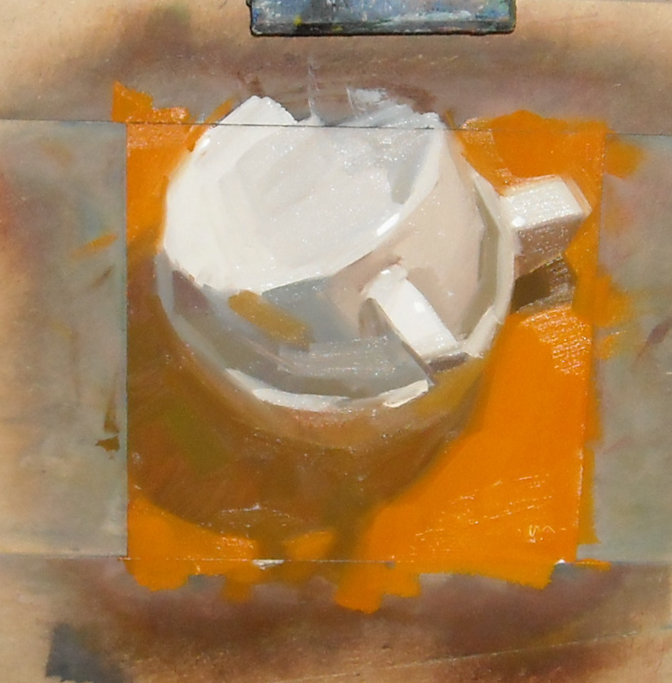
I forgot to take a picture of the painting before he started adding color.  Here you can see the three areas of light, mid and dark, but he has already starting adding color to the tea pot.


This is his finished painting:


Ok, so what did I do?   I tried to paint using his method of establishing the three areas of value.  I had a 12 X 16 canvas and used a really large brush to try to stay loose.  Here's my first effort:


It's totally unfinished!   I was trying to paint light and dark.  The only thing I liked was the dark shadow of the handle and the little sliver of light on the left side.  I was just happy that I could SEE that!  But gosh it looks amateurish next to his wonderful painting.  More workshops!


Friday, September 7, 2012

Red Plums # 2


8 " by 8" oil on canvas panel


This is my second painting of these plums.  I actually painted them the next day after the first painting, but I never got time to post them.

My daughter asked me what I'd do if one of my plums "disappeared".   I told her she could have them after I finished the painting.   I put them in the kitchen later and they really did disappear.


Tuesday, August 28, 2012

Red Plums


8 inch X 8 inch oil on canvas panel

I really enjoyed painting this one.  I think all the landscapes I've been painting helped me with my color mixing.  This one went quickly, and was one of those happy times at the easel.

 I used Alizarin Crimson darkened with Thalo Green for the darkest areas on the plums.  I lightened Alizarin Crimson with Cad Red Light and Cad Yellow medium.  And the background is Ultramarine Blue mixed with Titanium white.   For the highlights on the plums, I added a  little white to my plum "puddle".

Thanks for looking!


Wednesday, August 22, 2012

A daily painting....yea!


8 inch X 8 inch oil on canvas panel


It seems like forever since I've painted.  I had two of my grandchildren here for two weeks, a vacation, a family reunion and just general summer activities.  

Today though, I woke up with a desire to paint, so here's my effort for today...just a quick little sketch of flowers and fruit. Now that I took a photo, I can see lots of flaws.  Butt was fun to push the paint around.   Thanks for looking!


Monday, August 6, 2012

Village Street # 12 after Kevin MacPherson


11 inch X 14 inch oil on stretched canvas


This is different for me.  I saw this street scene in MacPherson's book and really liked the colors in the light and shadows.    It looks simple, but I can't believe how long it took me to finish.  I kept adjusting the light until I finally like the way light seems to reflect around the corner and on the street.

Thursday, July 5, 2012

Landscape # 11 After Kevin MacPherson


12 inch by 16 inch oil on stretched canvas

This is the second photo session for this painting.  I worked with my camera settings, and I think this version is more true to the actual colors in the painting.

I really enjoyed painting this one.  I loved seeing all the different colors MacPherson used in his trees.  I  feel like I am learning several things by copying these paintings.

For one, I am learning paint mixing.   He uses lots of grays in his paintings, and I've found that I mix big puddles of grays that I use to tone down and mix into other colors to try to get some of the colors in his paintings.

For another, I think I am learning to paint more loosely.  This is something I've struggled with, as my natural tendency has been to be very tight.  I hope I can keep this up!

I've been painting and practicing, but nothing I wanted to post.  A friend of mine is teaching a six-weeks course in portrait painting, which I've been attending.  I can use the practice to improve my drawing skills.  I may post some of the sketches I've done in this class later.

Thanks for stopping by!

Tuesday, June 12, 2012

Landscape # 10 after Kevin MacPherson


12" X 16" oil on stretched canvas

MacPherson called his painting "Cottonwood Camp".  I loved the way the rays of the setting sun touched the trees in this landscape.  It was also fascinating to see the colors that MacPherson used in the foliage.  These are entirely different greens than those in the mid-day sun.   I was mixing colors that  looked almost like khaki to me.   This one is my new favorite.

I have another one on my easel.  Again, it's in warm colors.   I think I'm going to have to try a cool painting just to force myself out of my comfort zone.


Sunday, May 20, 2012

Spring Hillside (# 9 after Kevin MacPherson)


(12 X 16 Oil on stretched canvas)


I bought a new book!  It's "Landscape Painting Inside & Out" by Kevin MacPherson.   If you've seen his book, you'll recognize that this is his cover painting.  I fell in love with it when I first saw it, and just had to try to paint it.

I think this is my favorite painting so far.  I just loved those fields of yellow and gold!

A friend was looking at my paintings and remarked, "Your favorite color is orange, isn't it?"  Looking at them with her, I could see a lot of orange!  It's not my favorite really...if asked, I'd say yellow.

One of my earliest memories involving color is from when I was in about the third grade.  My mother bought me a new chenille bedspread (remember those?) in a buttery yellow.  I remember being aware that it made my whole room seem filled with sunshine.

But  I really love all warm colors.   Those are the paintings I'm drawn too, and even the choices I make in my clothes.

I don't own anything that's blue...not in my clothes or in my house.  Not that I don't see the beauty of blues.  It's just that when I start making personal selections, I always choose warm colors.

A friend of mine usually paints with cool colors....blues, purples, greens, and I think her paintings are beautiful.   But that's not me.  I think it's interesting how each of us is drawn to different color choices.  I'd love to hear what's your favorite.

Tuesday, May 15, 2012

Still Waters (# 8 after Kevin Macpherson)


12 " X 16 " oil on stretched canvas


This was my first attempt to paint water.  I really enjoyed trying to make it look like the trees were reflecting in the lake.  Again, I am trying to learn to paint trees.  My favorite part of the painting is the two pine trees on the left.

I have been so busy in my "other life"  these days, that my only time spent painting is the two classes I take each week.  I have been painting, but not blogging much.  I will try to catch up on some of your work soon!


Wednesday, March 7, 2012

Evening Sky (#7 After Kevin MacPherson)


Painting skies was a lot harder than I thought when I started.  I wanted fresh, clean colors, but I didn't want it to look garish.

I painted this in layers, putting thin washes over previous layers before I was satisfied with the look of it.   It's like making a pot of soup...I add a little salt, adjust the seasonings, some cream, until it's yummy!

That is something that I have learned in my painting journey.  When I first started, I would feel like a failure if I couldn't mix a color and then put it on and leave it.  I'm learning that the colors are relative to each other, and I don't feel bad if I have to adjust an area to make it lighter or darker relative to the rest of the painting.  Feeling bad when I'm painting is not how I want to feel!

Wednesday, February 22, 2012

Landscape # 6 after Kevin MacPherson


12 inch by 16 inch oil on stretched canvas


I absolutely loved painting this one, and I think it's my favorite so far.

 There are more greens in this painting than in any of the others I have tried.  Mixing greens was tricky.  I didn't use any greens straight from the tube.  I used pthalo green mixed with alizarin crimson to make the dark shadows and varied the mixture from more to less red as needed.  Ultramarine blue mixed with yellows provided the other greens.

MacPherson's painting is titled "Summertime Stillness".   His style of painting is much looser than mine is.  I don't know if I'll ever be able to achieve that.   Even though I'm using a big brush, it's difficult for me to make a bold stroke and leave it!

There are still more paintings in this book that I'd like to try, but I bought his second book, and there is so much in it that I love!  Not enough time!


Friday, February 17, 2012

Spring Hillside


6 inch by 9 inch oil on canvas sheet

This is a small detail that I copied from Kevin MacPerson's painting Laguna Hillside.  I haven't tried painting wildflowers before, and I wanted to try to get patches of color rather than individual flowers.  I found that I was getting mud when I was painting wet into wet last night, so I let it sit to dry overnight.  Today I re-established the bright yellows.  I had fun with this one.  The mood in this painting is much brighter than the previous one.

Have a good weekend!

Monday, February 13, 2012

Where's the Red?


6 inch X 9 inch oil on canvas sheet

I'm still enjoying trying to learn painting landscapes. I remember reading on someone's blog (I'd like to give credit, but I read so many I don't remember) about landscape classes he was taking.  His teacher's mantra was "where's the red?".   His point was that a landscape painting was dull and lifeless without the addition of some red to act as a counterpoint to all the greens.

I have found that to be true.  I add alizarin crimson to the shadows, and burnt sienna and even cad red light to highlights.  Those few strokes can bring a dull area to life.


Saturday, February 11, 2012

White on White Challenge


6 inch X 9 inch oil on canvas sheet

I painted this for the DPW weekly challenge.  I thought I was finished several times, but after I'd come back to it I'd see areas that weren't right.

Painting white really is a challenge!  I've been reading the posts from other people who entered, and we all agree it is difficult.  I could see colors in the reference photo, so I tried to bring those into my painting.

I remember in one of my earliest painting classes, I was struggling to make my "floating fruit" sit down on  the table.  My teacher came by and asked, "Why did you put purple in that shadow?  There isn't any purple there."  I dutifully took it out.   Now I put purple in my shadows if I want to!  Heh.

Friday, February 10, 2012

Fast and Loose Lemons


4.5 inch X 6 inch acrylic on canvas sheet

This was a fun painting.  I bought four tubes of acrylic paint--red, yellow, blue and white.  I've seen painters who make an underpainting with acrylic and then paint on that with oils.   I thought I'd like to try it.  

Karen Mathison Schmidt is one of my favorite artists who uses this technique.  She creates rich, luminous paintings with lots of glazing and underpainting.  Check out her blog. 

Anyway, I started out with the paints on a paper plate,  thinking of making an underpainting.  Once I got started, I did the whole thing in acrylic.  They dry fast, so it was a completely different feeling from oils.  I painted  much looser than I do with oils.  And it was fun to see what I could do with just three colors. 
I'll have to try the underpainting another day. 

Have a good weekend! 


Monday, February 6, 2012

Landscape # 5 after Kevin MacPherson


12 inch X 16 inch oil on stretched canvas

Another landscape in my quest to paint my way through Kevin MacPerson's book.  This is the first time I have attempted to paint animals.    I worked on this in my weekly class, and for awhile there was a lot of hilarity about the little gray lumps in the foreground.  I put shapes in there, but I didn't try to make them look like sheep until the last day of painting.    There was lots of guessing as to what they would be.

Carol Marine made a comment one day in class that when she was first starting out, even when she didn't think a painting was a success,  she'd try to find maybe one thing that she did like about it.  That would keep her encouraged.  I'm trying to adopt that attitude, so that I don't get totally discouraged.  So....what I like about this painting are the mesquite trees on the right.

However, I find every one of these a great learning experience.  Thanks for visiting!


Tuesday, January 31, 2012

Seated Figure Challenge


8 inch by 8 inch oil on canvas panel

This was my attempt at the challenge photo on DailyPaintworks.  Before I started, I decided that I would focus on the figure only, and not try to put in any of the background details.  I wanted to show how the light was hitting the man.  I did this with a huge brush and about one hour, so I couldn't work it to death.
My favorite part is the legs.  I didn't get the light on his shoulders right, but no going back!  Onward!


Wednesday, January 25, 2012

Landscape # 4 after Kevin MacPherson


12 inch X 16 inch oil on stretched canvas

This is the fourth painting I've done in my project of painting my way through Kevin MacPherson's book, "Fill Your Oil Paintings With Light and Color".

 MacPherson's painting is called Sunlit Hills And Sycamores.  He painted his tree branches using negative shapes by painting the clouds and sky and foliage over the branches.  I tried to do that, but wasn't as successful as I'd like to be at that.  Need more lessons!  I'd actually like to see him do that in person, as I'm not sure how he achieved it.  Mine was sort of trial and error.

I am happy with the way the painting turned out, though.  I learn something new every time I do one of these.  I've already started another one!

Sunday, January 22, 2012

Small Study


This small study was done in about two hours.  I dropped it and scratched it when I was carrying it, and I am too fed up to work on it any more.  So I took a picture, scratch and all.

I still am having a difficult time laying in my dark values dark enough initially.  I keep having to go back and darken and correct.  I hope it comes with time.  Thanks for looking!


Friday, January 20, 2012

Workshop Last Day

My camera wasn't working on Thursday, so I couldn't take any pictures.  I was thinking I needed a new one until I got home.  Then I discovered I had left the memory chip in the computer when I'd downloaded photos the night before.  Doh!

Here are pictures of Carol's demo on Friday.


This was Carol's set up. 


This is her drawing.


The completed painting. 


I loved sitting right beside her easel on that day, and I got to watch her mix her paints.  It's almost as fascinating as watching her paint.  

A lot of us wanted to paint eggs that day, so I tried my hand at that.


My first attempt was too pale, so I went back to a small four by four inch sketch.

The dark side of the brown egg looked almost like chocolate.  My brain kept telling me it couldn't be that dark!   And it's as smooth as a baby's behind.   I like the reflected light, though.

Carol's still painting eggs.  Check out her blog.


Sunday, January 15, 2012

Workshop Day 3

On Wednesday, Carol painted a demo of eggs. 


This was her set up. 


This is her finished drawing.  Again, notice that she completed the ellipse outside the canvas.


This is the finished painting.  Not the best photo because I took it indoors with a flash.  The photo doesn't capture the wonderful glow of the golden shadows cast through the eggs.


After Carol's demo and lesson, she put us to work with some ten minute exercises.   A lot of us painted apples, which warmed under our lights, and soon the studio was filled with a wonderful apple fragrance. 


My first set of exercises I used too large a canvas, so for the second attempt, I taped off four inch squares on a canvas board.  Even at that size, I never had time to finish the background.  On my first apple I used white to try to capture the reflected light, and it looks rather pink.  Carol recommended I use yellow to lighten the apple, and I like that a lot better.   Here are my apples:


After lunch I was hating those apples, so I switched to lemons.  We were supposed to try to lay down a stroke without blending.  My first lemon is totally blended.  When Carol told me the second one still looked blended, I laughed and told her "that's my chunky".   I always have great plans to paint loose, but what comes out of my brain is something else.  


After Carol's beautiful egg painting, the next day we all switched to trying to paint eggs! 


Wednesday, January 11, 2012

Day 2!

Tuesday started with another demo with Carol.  Lordy.  She mixes a new puddle of paint for each stroke. It's amazing.  And she almost never has to say oops, wrong color.  She mixes each puddle beside the one for the previous stroke so she can compare the values.


Carol's set up. 

The completed drawing.


The finished painting.  Notice how she painted the ellipse off the edge of the canvas.


Her palette after the painting was completed.  


Next Carol had us paint some value paintings, using only burnt umber.   The idea was to have three basic values, light, medium and dark.  We were to make three paintings, with one each with one of those primary values.   We scrubbed the umber on and lifted out the highlights.  Mine were primarily paper towel paintings, not brushes.  

Carol reminded us to SQUINT to see the values.  She said we should practice squinting all the time, not just when we are painting.  She said, "It's like Kegel exercises!"  We were falling off our chairs, laughing!


Here are my three.  


Primarily dark.  My least favorite.  


Primarily medium values, some lights,  with a smidge of dark.  


Primarily light values.  

These painting were fun, and I was feeling pretty good.  It built me up for the fall I was going to take on day three.  On day three we added color!  Ack!