Wednesday, March 7, 2012

Evening Sky (#7 After Kevin MacPherson)


Painting skies was a lot harder than I thought when I started.  I wanted fresh, clean colors, but I didn't want it to look garish.

I painted this in layers, putting thin washes over previous layers before I was satisfied with the look of it.   It's like making a pot of soup...I add a little salt, adjust the seasonings, some cream, until it's yummy!

That is something that I have learned in my painting journey.  When I first started, I would feel like a failure if I couldn't mix a color and then put it on and leave it.  I'm learning that the colors are relative to each other, and I don't feel bad if I have to adjust an area to make it lighter or darker relative to the rest of the painting.  Feeling bad when I'm painting is not how I want to feel!

Wednesday, February 22, 2012

Landscape # 6 after Kevin MacPherson


12 inch by 16 inch oil on stretched canvas


I absolutely loved painting this one, and I think it's my favorite so far.

 There are more greens in this painting than in any of the others I have tried.  Mixing greens was tricky.  I didn't use any greens straight from the tube.  I used pthalo green mixed with alizarin crimson to make the dark shadows and varied the mixture from more to less red as needed.  Ultramarine blue mixed with yellows provided the other greens.

MacPherson's painting is titled "Summertime Stillness".   His style of painting is much looser than mine is.  I don't know if I'll ever be able to achieve that.   Even though I'm using a big brush, it's difficult for me to make a bold stroke and leave it!

There are still more paintings in this book that I'd like to try, but I bought his second book, and there is so much in it that I love!  Not enough time!


Friday, February 17, 2012

Spring Hillside


6 inch by 9 inch oil on canvas sheet

This is a small detail that I copied from Kevin MacPerson's painting Laguna Hillside.  I haven't tried painting wildflowers before, and I wanted to try to get patches of color rather than individual flowers.  I found that I was getting mud when I was painting wet into wet last night, so I let it sit to dry overnight.  Today I re-established the bright yellows.  I had fun with this one.  The mood in this painting is much brighter than the previous one.

Have a good weekend!

Monday, February 13, 2012

Where's the Red?


6 inch X 9 inch oil on canvas sheet

I'm still enjoying trying to learn painting landscapes. I remember reading on someone's blog (I'd like to give credit, but I read so many I don't remember) about landscape classes he was taking.  His teacher's mantra was "where's the red?".   His point was that a landscape painting was dull and lifeless without the addition of some red to act as a counterpoint to all the greens.

I have found that to be true.  I add alizarin crimson to the shadows, and burnt sienna and even cad red light to highlights.  Those few strokes can bring a dull area to life.


Saturday, February 11, 2012

White on White Challenge


6 inch X 9 inch oil on canvas sheet

I painted this for the DPW weekly challenge.  I thought I was finished several times, but after I'd come back to it I'd see areas that weren't right.

Painting white really is a challenge!  I've been reading the posts from other people who entered, and we all agree it is difficult.  I could see colors in the reference photo, so I tried to bring those into my painting.

I remember in one of my earliest painting classes, I was struggling to make my "floating fruit" sit down on  the table.  My teacher came by and asked, "Why did you put purple in that shadow?  There isn't any purple there."  I dutifully took it out.   Now I put purple in my shadows if I want to!  Heh.

Friday, February 10, 2012

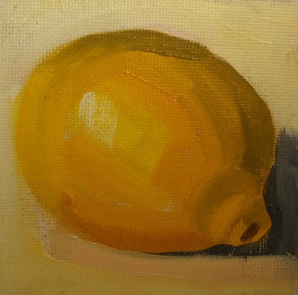
Fast and Loose Lemons


4.5 inch X 6 inch acrylic on canvas sheet

This was a fun painting.  I bought four tubes of acrylic paint--red, yellow, blue and white.  I've seen painters who make an underpainting with acrylic and then paint on that with oils.   I thought I'd like to try it.  

Karen Mathison Schmidt is one of my favorite artists who uses this technique.  She creates rich, luminous paintings with lots of glazing and underpainting.  Check out her blog. 

Anyway, I started out with the paints on a paper plate,  thinking of making an underpainting.  Once I got started, I did the whole thing in acrylic.  They dry fast, so it was a completely different feeling from oils.  I painted  much looser than I do with oils.  And it was fun to see what I could do with just three colors. 
I'll have to try the underpainting another day. 

Have a good weekend! 


Monday, February 6, 2012

Landscape # 5 after Kevin MacPherson


12 inch X 16 inch oil on stretched canvas

Another landscape in my quest to paint my way through Kevin MacPerson's book.  This is the first time I have attempted to paint animals.    I worked on this in my weekly class, and for awhile there was a lot of hilarity about the little gray lumps in the foreground.  I put shapes in there, but I didn't try to make them look like sheep until the last day of painting.    There was lots of guessing as to what they would be.

Carol Marine made a comment one day in class that when she was first starting out, even when she didn't think a painting was a success,  she'd try to find maybe one thing that she did like about it.  That would keep her encouraged.  I'm trying to adopt that attitude, so that I don't get totally discouraged.  So....what I like about this painting are the mesquite trees on the right.

However, I find every one of these a great learning experience.  Thanks for visiting!


Tuesday, January 31, 2012

Seated Figure Challenge


8 inch by 8 inch oil on canvas panel

This was my attempt at the challenge photo on DailyPaintworks.  Before I started, I decided that I would focus on the figure only, and not try to put in any of the background details.  I wanted to show how the light was hitting the man.  I did this with a huge brush and about one hour, so I couldn't work it to death.
My favorite part is the legs.  I didn't get the light on his shoulders right, but no going back!  Onward!


Wednesday, January 25, 2012

Landscape # 4 after Kevin MacPherson


12 inch X 16 inch oil on stretched canvas

This is the fourth painting I've done in my project of painting my way through Kevin MacPherson's book, "Fill Your Oil Paintings With Light and Color".

 MacPherson's painting is called Sunlit Hills And Sycamores.  He painted his tree branches using negative shapes by painting the clouds and sky and foliage over the branches.  I tried to do that, but wasn't as successful as I'd like to be at that.  Need more lessons!  I'd actually like to see him do that in person, as I'm not sure how he achieved it.  Mine was sort of trial and error.

I am happy with the way the painting turned out, though.  I learn something new every time I do one of these.  I've already started another one!

Sunday, January 22, 2012

Small Study


This small study was done in about two hours.  I dropped it and scratched it when I was carrying it, and I am too fed up to work on it any more.  So I took a picture, scratch and all.

I still am having a difficult time laying in my dark values dark enough initially.  I keep having to go back and darken and correct.  I hope it comes with time.  Thanks for looking!


Friday, January 20, 2012

Workshop Last Day

My camera wasn't working on Thursday, so I couldn't take any pictures.  I was thinking I needed a new one until I got home.  Then I discovered I had left the memory chip in the computer when I'd downloaded photos the night before.  Doh!

Here are pictures of Carol's demo on Friday.


This was Carol's set up. 


This is her drawing.


The completed painting. 


I loved sitting right beside her easel on that day, and I got to watch her mix her paints.  It's almost as fascinating as watching her paint.  

A lot of us wanted to paint eggs that day, so I tried my hand at that.


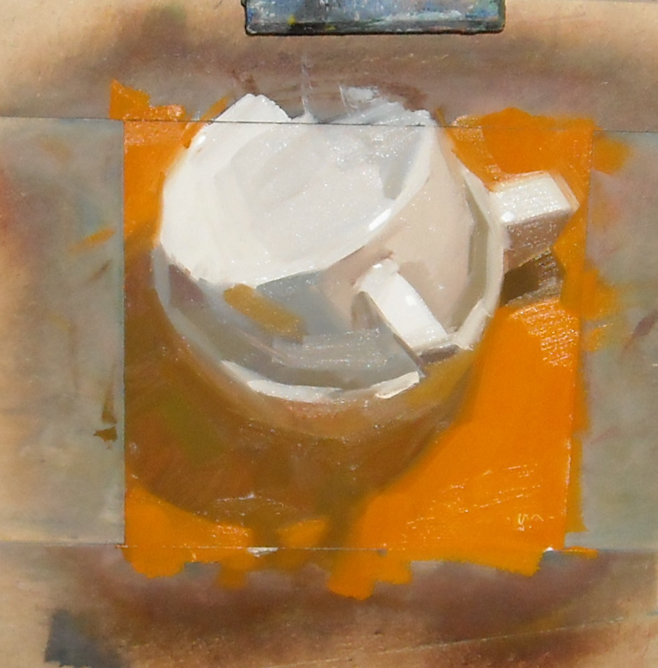
My first attempt was too pale, so I went back to a small four by four inch sketch.

The dark side of the brown egg looked almost like chocolate.  My brain kept telling me it couldn't be that dark!   And it's as smooth as a baby's behind.   I like the reflected light, though.

Carol's still painting eggs.  Check out her blog.


Sunday, January 15, 2012

Workshop Day 3

On Wednesday, Carol painted a demo of eggs. 


This was her set up. 


This is her finished drawing.  Again, notice that she completed the ellipse outside the canvas.


This is the finished painting.  Not the best photo because I took it indoors with a flash.  The photo doesn't capture the wonderful glow of the golden shadows cast through the eggs.


After Carol's demo and lesson, she put us to work with some ten minute exercises.   A lot of us painted apples, which warmed under our lights, and soon the studio was filled with a wonderful apple fragrance. 


My first set of exercises I used too large a canvas, so for the second attempt, I taped off four inch squares on a canvas board.  Even at that size, I never had time to finish the background.  On my first apple I used white to try to capture the reflected light, and it looks rather pink.  Carol recommended I use yellow to lighten the apple, and I like that a lot better.   Here are my apples:


After lunch I was hating those apples, so I switched to lemons.  We were supposed to try to lay down a stroke without blending.  My first lemon is totally blended.  When Carol told me the second one still looked blended, I laughed and told her "that's my chunky".   I always have great plans to paint loose, but what comes out of my brain is something else.  


After Carol's beautiful egg painting, the next day we all switched to trying to paint eggs! 


Wednesday, January 11, 2012

Day 2!

Tuesday started with another demo with Carol.  Lordy.  She mixes a new puddle of paint for each stroke. It's amazing.  And she almost never has to say oops, wrong color.  She mixes each puddle beside the one for the previous stroke so she can compare the values.


Carol's set up. 

The completed drawing.


The finished painting.  Notice how she painted the ellipse off the edge of the canvas.


Her palette after the painting was completed.  


Next Carol had us paint some value paintings, using only burnt umber.   The idea was to have three basic values, light, medium and dark.  We were to make three paintings, with one each with one of those primary values.   We scrubbed the umber on and lifted out the highlights.  Mine were primarily paper towel paintings, not brushes.  

Carol reminded us to SQUINT to see the values.  She said we should practice squinting all the time, not just when we are painting.  She said, "It's like Kegel exercises!"  We were falling off our chairs, laughing!


Here are my three.  


Primarily dark.  My least favorite.  


Primarily medium values, some lights,  with a smidge of dark.  


Primarily light values.  

These painting were fun, and I was feeling pretty good.  It built me up for the fall I was going to take on day three.  On day three we added color!  Ack!  


Tuesday, January 10, 2012

Carol Marine! First Workshop Day

I am so happy to be attending Carol's workshop here in San Antonio.  I attended one of her workshops four years ago with my daughter.  Now that I've been painting for a couple of years,  I can understand and relate to what she is telling us much better than I could the first time.  I'm not saying I can DO it, I just can comprehend better!

I thought you'd like to see pictures of Carol painting a demo for our class.  She makes it look so effortless, I think, "Yes!  I can do that!"     And then we paint.  Sigh.   Well, maybe tomorrow.

Carol always uses a viewfinder to draw her paintings.  She has toned the canvas with burnt umber, then draws with burnt umber.  She first locates the edges of the objects with small marks, then draws them in.  You can see she used lines to draw the ellipse of her cup.  Next she uses a paper towel to wipe off the excess paint so it doesn't contaminate the colors of her painting. 

This shows her completed sketch.  She also draws in her shadows are a part of her sketch. 

Carol first paints in "islands of color".   Then she paints in the "ocean" around her islands.  She says it helps her to control her edges better.  

The second apple. 

The rest of the apples and the beginning of the mug. 


The finished painting.  My photo has a little glare, but you can see how beautiful it is. 
You can see she paints off the edge of the canvas onto her canvas holder.  She says it helps her with the ellipses.  


After lunch, Carol had us each compose a set up and paint so that she could see where we each were.  
I tried something new.   She paints with a very limited palette, and I tried to paint using only her colors.  I had a very hard time making gray.  She mixes gray from red, yellow, blue and white, so I tried to do that.  I had a difficult time---it came out very blue...


Sunday, December 18, 2011

Light and Shade after Kevin MacPherson


Another painting in my series of painting my way through Kevin MacPherson's book.  I just loved the way the sunlight spilled across his painting, making bright highlights on the mountains and trees, and casting the deep shadows.  His painting is called, "Palm Desert".

I am learning not to try to duplicate his paintings exactly.  I can't actually,  but I'm no longer grief stricken about it.  I am just enjoying the process.  I think these are my best trees, so far.    I thoroughly enjoyed this painting.  Fun!

And deep gratitude and thank you's to everyone who stopped by, commented and inquired about me during my long dry spell.   You guys are great!

Monday, November 14, 2011

Study in grays and brights


12" X 16 " oil  on canvas panel

This is my second painting I have done in my project of painting my way through Kevin MacPherson's book "Fill Your Oil Paintings with Light and Color".  His painting is called "Flaming Maple".

His commentary says, "Grays complement brights.  If everyone is shouting, no one is heard.  If all your colors are bright and intense, nothing stands out."

Graying the colors was the most difficult part of this painting.  His painting looks like there is fog in the distance, so the far trees are just barely visible.  The sky is such a light gray, it is almost white.  I kept having to correct and correct the sky.  I would think it was light enough, then realize it was still too dark.

The meadow area in the background left is a very light gray-green.  I was surprised how light the color looked on my palette, but it was the right color.  Now that I took the photo, I think my tree-trunks on the middle trees look too dark, but they are dark in his painting.  So maybe my foliage there isn't dark enough, rather than the trunks being too dark.

I really want to thank every single person who has visited my blog over the past month.   Our house has been like a convalescence home for a good while.  First my daughter had surgery and I nursed her for two week.  Then I had sinus surgery and moped around for another two weeks.   So I was so cheered by the visits and good wishes!  Thanks again!

Friday, October 28, 2011

I Think It's Done....


I've been working on this for three days, about two hours each on Tuesday and Wednesday in class.  Then I brought it home and sat it on my easel and studied it for a day.  Today I tweaked the trees.  I hadn't made the trunks light enough and they melted into the background.

This is my first finished painting from painting my way through Kevin MacPhearson's book.  MacPhearson's work is called "Full Moon Rising".  I had a great time working on this, and learned a lot about trying to paint trees.  I used a lot of different brushes to get different effects, which was a first for me.  I used every side of the brushes too, not just the flat side.  And I used the smallest brush ever for the tree limbs.  Just couldn't make those little brush strokes any other way.

I also practiced graying colors, and learned how to mix some colors that were new to me.  So now I'm ready for my next attempt at his book.  It will be another landscape.

12 inch X 16 inch oil on stretched canvas

Have a great weekend!

Wednesday, October 19, 2011

W.I.P. Landscape - First color pass


Click on painting to view larger.
12 X 16 inch oil on stretched canvas

Not too good a photo...the colors aren't true.  I took lots of shots, but this is about the best one.

This is my first application of color to the underpainting I posted last week.  I want to let this layer dry before I go in and work on the trees on the right.  I think I may be doing a lot of wiping off!  Trees are a lot harder than apples and pots!  LOL.


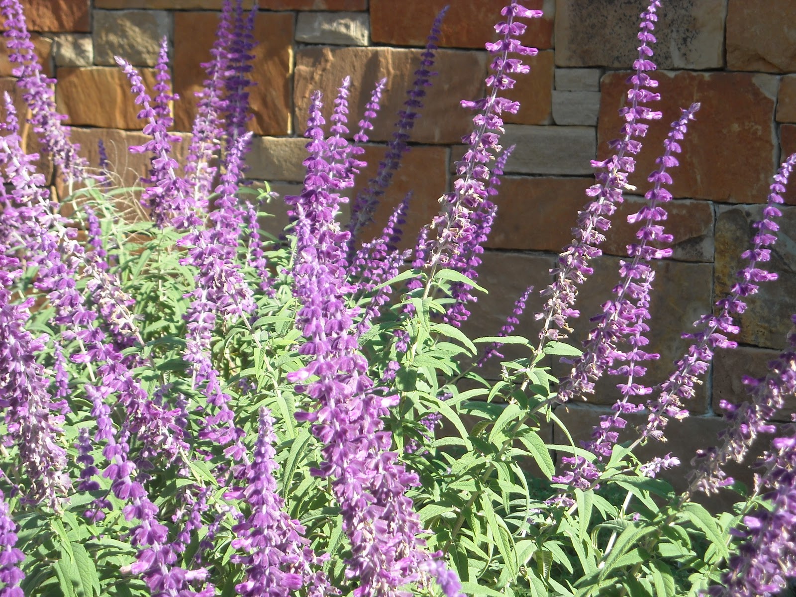
Mexican Sage 


Lantana


Also, for your viewing pleasure,  I'm posting picture of some plants that survived our drought thanks to my husband.   We moved into our house with new landscaping and within one week our neighborhood went to stage 4 water restrictions, meaning hand watering only, between 6 to 9 p.m.   My husband stood outside in 100 degree heat every day for two months, watering our new trees and shrubs.   We didn't loose any trees, but a few shrubs didn't make it.  The majority survived, though and I'm thrilled that after our recent rains they are blooming their little heads off!

Tuesday, October 18, 2011

I had the best weekend!


"Mountain Skies"  8 inch X 8 inch oil on canvas panel
I painted this from a photo of our trip to Wyoming.   I need to practice trees some more.

My husband and I drove to Fredericksburg on Sunday, which is about an hour from San Antonio, a nice Sunday drive.  When I was growing up, folks would take Sunday drives, but I don't think anyone does that much anymore.  The daily commute for my family members gives most of them all the driving they want to do every week.  But since I've retired, I don't have to commute any more, so I enjoy driving places with my husband.

Fredericksburg is an old German settlement, with lots of old buildings that have been restored and turned into cute shops and galleries.  I especially wanted to visit the Good Art Company gallery, because Ruth Andre had blogged that she had some paintings accepted there.  I've seen her work online, but was glad to have the chance to see some of them in person.  She paints beautiful horses!

Also in the gallery were paintings by Nancy Medina.   I was delighted to see her beautiful florals in person.   I've never met either artist, but follow both online, so I had this feeling of connection to the art and artists.

We also visited a gallery called Insight Gallery.  It was a thrill to see works by Scot Burdick.  He has written about and has a youtube video on "The Banishment of Beauty", the clash between representational art and abstract art.  I remember watching his video several years ago, so I was excited to see some of his paintings.

Works by Quang Ho and Scot Christensen are being featured by Insight Gallery for the month of October.  Quang's works are vivid and exciting.  However, the highlight of my day was an enormous landscape by Scot Christensen.  (Click on the link and then click on Gallery to see a slide show of some of his paintings.) He paints in wonderful muted colors with beautiful strong brushstrokes.   I could have looked at that painting all day.

I have only become aware of Christensen within the past month, and I wonder how could I not have known?  I feel sort of the same way as when I learn a new word, and then I find out everyone else has been using that word all along.  Girl, he's famous!  I plead ignorance.

The painting was offered at $52,000.  My husband asked me how he could charge so much for his paintings.  My answer was that his talent is that rare.

Thursday, October 13, 2011

Quick Flower Sketch


I painted this using a canvas toned with dark green.  It was actually one that I'd painted over about a month ago and today I thought I'd use it.   I've seen other paintings where the artist used a dark, or even black, toned canvas, and I liked the effect.   I like this much better than my original painting.

I used a number 8 bright brush and had fun.  The best part is that I overcame my tendency to be very tight and detailed and blend-y.

7 inch X 9 inch oil on canvas panel

Friday, October 7, 2011

Landscape Underpainting


This is the underpainting for a landscape that I started in my weekly class.  Our instructor has us use transparent oil color to sketch in our study and values.

I watched the movie "Julie and Julia" last week.  Its about a young woman who decides to cook all of the recipes in Julia Child's cook book in one year.  It gave me the notion that I want to paint my way through a book.    I have Kevin MacPherson's book, "Fill your Oil Paintings with Light & Color".  He gives steps for how he first blocks in his paintings and then discusses his finished paintings.

Julie Ford Oliver has been painting and posting a series that she calls Painting the Masters.  She stated that she has learned a lot from studying and copying the works of various artists.

That's what I hope to gain by copying some of MacPherson's works.  So this is my first attempt to paint from his book.  His painting is called "Full Moon Rising".

12 inch X 16 inch oil on stretched canvas

Tuesday, October 4, 2011

Two and a Half Plums


This has nothing to do with Charlie Sheen's former show.  I just like the cadence of the title.

I've been trying to figure out what about my own paintings make me unhappy, and I believe I've figured it out.  Some of them of course are just flat ugly, or as my daughters used to say, YOU-gly.   But apart from that.  I have been trying to change my style of painting to a looser one.

When I first started painting, I wanted my painting to look exactly like the set up.  If it looked smooth and realistic, I was happy.  Now I'd like to paint with a looser style and "see" more colors.  I'm not able to achieve that and so when I've finished a painting, it might not be ugly, but I'm not happy with it.  That's what I keep whining about.   Please just bear with me!

8 inch X 8 inch oil on canvas panel

Monday, October 3, 2011

Vase and Oranges


This little study was an experiment.  I saw a challenge on the DPW website to paint a color painting of a black and white photo.  There was a black and white photo in one of my art books, so I thought I'd try to paint it in color.

The background color is a big mistake.  I premixed colors and I thought they looked good on the palette, but I don't like them in the painting.

Claudia Hammer had a funny post of a painting she wasn't happy with.   She said that people would point and laugh at it.   Claudia is a terrific artist, so her idea of a failure is at a lot higher level than mine.  So please, no pointing and laughing.  If you must snicker, please cover your mouth.

8 inch X 8 inch oil on canvas panel

Friday, September 30, 2011

I was blown away...


Today I went to the Hunt Gallery in San Antonio to see  Lorraine Shirkus'  work on display in the gallery. The show was a collection of works by 14 women artists.  Lorraine has three paintings on her own wall as you enter the gallery.  I recognized them immediately.

Words fail me.  I am in awe!    Lorraine's work is incredible.    The photos on her blog don't begin to show the richness, the depth, and the layers of color she applies to her canvas.   The woman can paint!

I told her I felt like I should come home and burn all my paintings.  LOL.